


In an advertising campaign, every piece of creative works in concert with the others. Most potential ticket buyers will encounter your show several times before ever deciding to purchase — whether through an Instagram ad, a subway poster on their commute or a web banner while researching online. Brand consistency is the thread that ties these moments together, with color being the most recognizable element audiences carry from one encounter to the next. A strong, cohesive color palette unifies your campaign and strengthens recall. This ensures that once a ticket buyer decides to make a Broadway purchase, your show comes to mind.
Setting the stage with color
Color does more than decorate: It provides immediate context. You won’t always have photography, key art or quotes to rely on — depending on the ad placement or resources available. In a crowded Broadway landscape, color (and consistency with it) is a foundational asset in communicating a show’s value at a glance.
Color as an identity
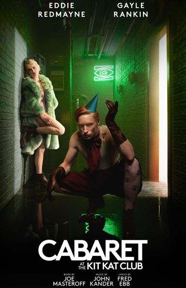
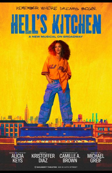
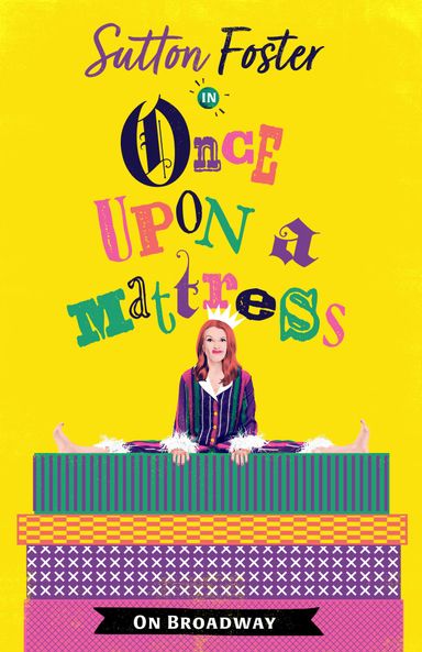
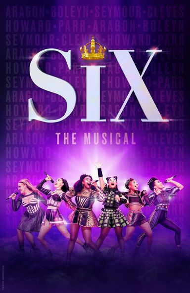
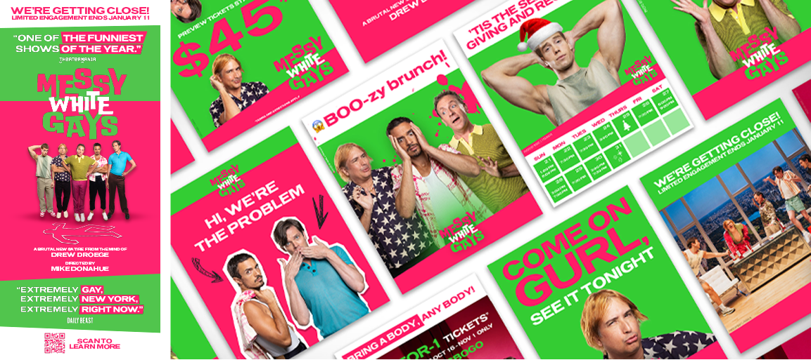
With only seconds to capture attention, cues like color can quickly shape perception and spark interest. Many productions use color to reinforce identity and maintain familiarity across different campaigns. Take “SIX,” for example. The rich purple evokes royalty and hints at themes of reclaimed identity and feminine strength. In conjunction with photos featuring the iconic “SIX” queens in costume, viewers can infer that this is a modernized take on the history of the crown. Despite the show’s creative assets changing over the years, whether through cast changes or shifts in messaging, these Broadway colors have remained instantly recognizable throughout the musical’s run. “Messy White Gays,” on the other hand, used a bright pink and green color scheme. These colors imply a comedic tone, as the contrasting color pair creates a chaotic atmosphere. The brighter palette implies a light-hearted emotional tone — a show full of laughs, chaos and absurdity.
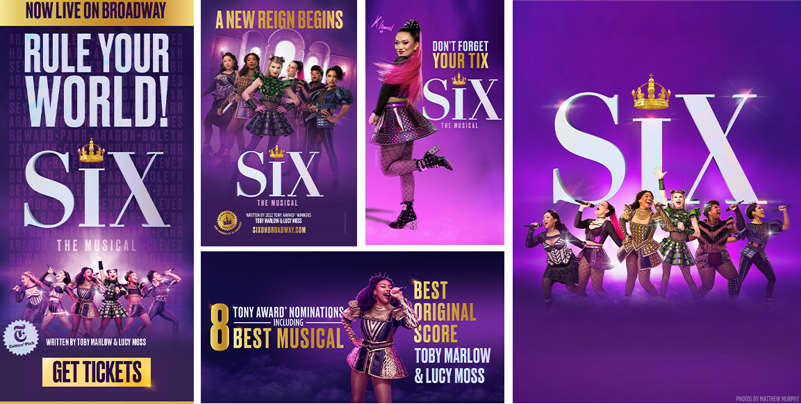
Unlike photography or campaign messaging, which often evolve, color systems frequently remain consistent. A recognizable palette causes viewers to maintain familiarity with the brand over time.
Maintaining consistency across placements
Establishing a color palette is only the first step. The greater challenge is maintaining that identity across the many environments where Broadway advertising appears: Instagram ads, subway posters, coffee sleeves, merchandise, billboards and beyond.