










“Rent,” “Hamilton,” “Chicago,” “Hadestown,” “The Book of Mormon,” “Beetlejuice” and “Paranormal Activity” — these are just some of the beloved shows that have worked with SpotCo Advertising over the past 30 years. Founded by Drew Hodges, the advertising agency has helped launch some of the most recognizable campaigns in Broadway history, adjusting their strategies to meet changes in audience expectations and entertainment trends along the way.
Broadway News spoke to the two managing directors who now run SpotCo — chief client officer Stephen Sosnowski who has been with SpotCo for 20 years, and chief creative officer Callie Goff who has been with SpotCo for 15 years — about the ad agency’s three decades supporting the Main Stem. Amidst its campaigns for hundreds of productions, the duo looks back at the company’s launch of five standout shows — productions that illustrate important chapters in the agency’s history and the theatrical advertising industry at large.
Reaching new audiences with ‘Rent’
Before founding SpotCo, Hodges ran Spot Design, with a client roster that spanned Swatch, MTV, Comedy Central, Nickelodeon, Sony Music and Geffen Records — but didn’t yet include live theater. In 1996, Hodges was hired to work with Broadway advertising firm Serino Coyne to help market “Rent,” Jonathan Larson’s musical about young artists in New York City in the late ’80s and early ’90s.
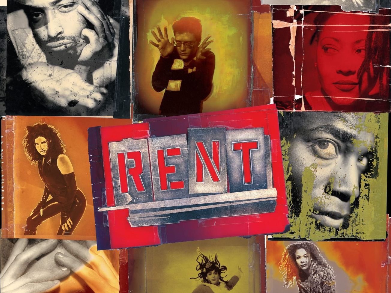
“David Geffen [who invested in the cast album] wanted the artwork for the cast recording to really look like a rock ‘n’ roll album,” said Sosnowski. “At the time, Broadway was all about the big logos — the ‘Phantom [of the Opera]’ mask, the ‘Miss Saigon’ helicopter, the ‘Cats’ eyes, the Cosette [of ‘Les Miserables’], which is great. But because ‘Rent’ is such a unique show, Drew saw an opportunity to reach audiences that traditional Broadway shows and their advertising weren’t already reaching.”
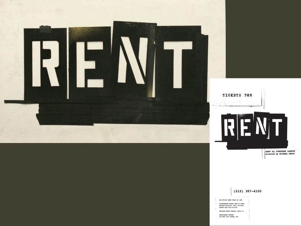
“The title treatment, with those iconic stamped letters, is still used all over the world,” noted Goff of the lasting ‘Rent’ visual, which was also paired with stylized portraits of the actors in character — something no Broadway show was doing then, especially with an ensemble cast of mostly unknown — though talented — actors.”
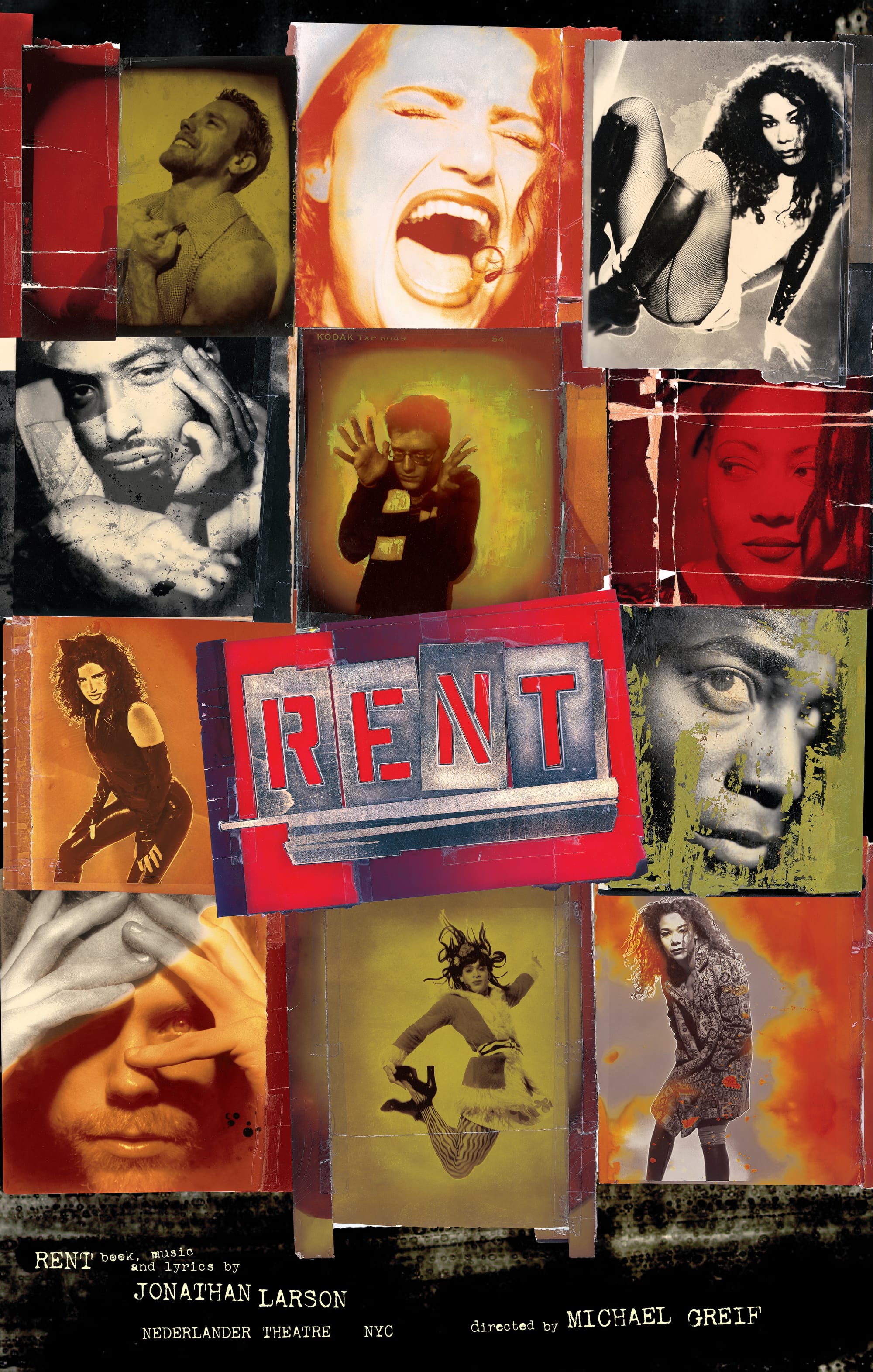
“Drew had really thought about, ‘If these characters were making the [key] art, what would it look like?’” Goff continued. “That’s why it had this real and authentic feeling, which was perfect for a musical that really redefined what musicals can be.” And redefined who was in the audience. After successfully finalizing the graphic identity of “Rent,” Spot Design was relaunched in 1997 as SpotCo Advertising, a full-service agency. No day but today, indeed.